Grocery Delivery app
Dunzo app : UX Case study
Dunzo app : UX Case study
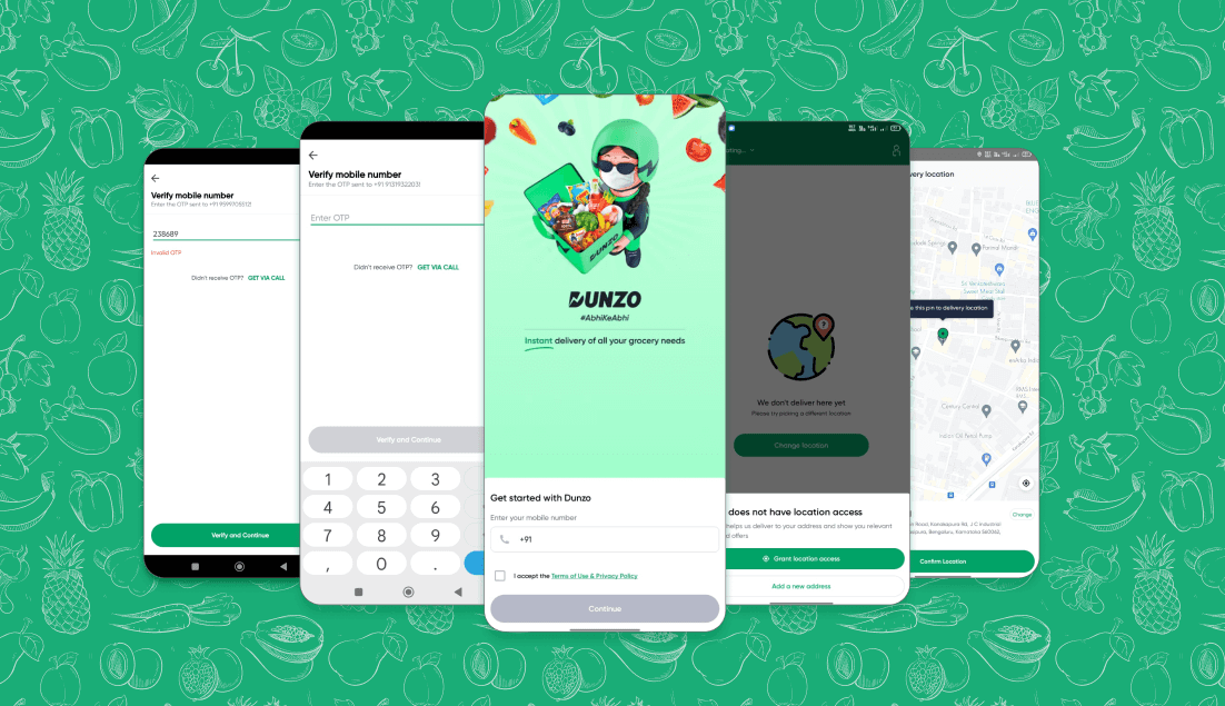
Dunzo is a local delivery app widely used for ordering groceries, medicines, food, and more. While the platform is known for convenience, I saw opportunities to refine its user flow, reduce cognitive load, and enhance the overall shopping experience.
Dunzo is a local delivery app widely used for ordering groceries, medicines, food, and more. While the platform is known for convenience, I saw opportunities to refine its user flow, reduce cognitive load, and enhance the overall shopping experience.

Overview
Overview
Dunzo is a grocery delivery app. I spotted opportunities to simplify its user flow, reduce clutter, and enhance the shopping experience. This case study shows how I improved navigation and overall usability.
Dunzo is a grocery delivery app. I spotted opportunities to simplify its user flow, reduce clutter, and enhance the shopping experience. This case study shows how I improved navigation and overall usability.
Key Challenges
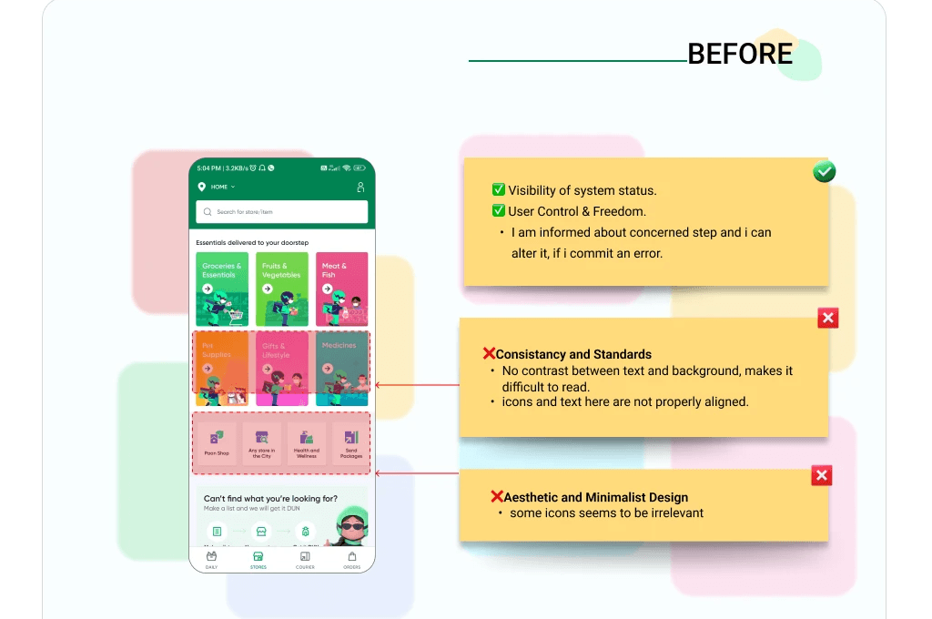
Information Overload: Cluttered categories made it difficult for users to find key items quickly.
Lack of Feedback: No micro-interactions or cues when adding items or switching tabs.
Redundant Checkout Steps: Address confirmation and payment selection added unnecessary friction.
Information Overload: Cluttered categories made it difficult for users to find key items quickly.
Lack of Feedback: No micro-interactions or cues when adding items or switching tabs.
Redundant Checkout Steps: Address confirmation and payment selection added unnecessary friction.
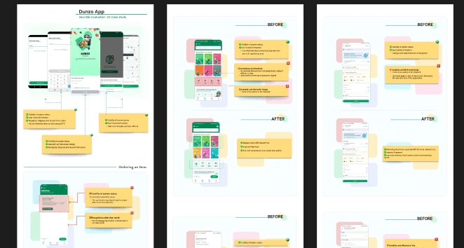
Process Snapshot
Conducted an audit of the existing app to find UX gaps.
Gathered feedback from frequent users.
Identify drop-off points.
Designed mockups to test iterations.
Impact
Impact
My redesign led to 30% faster checkout flow during testing and increased user satisfaction with product discovery. I also introduced cleaner layouts to improve visual clarity and delight.
My redesign led to 30% faster checkout flow during testing and increased user satisfaction with product discovery. I also introduced cleaner layouts to improve visual clarity and delight.